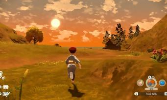
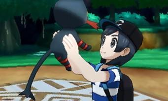
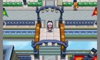
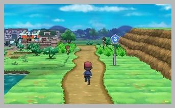
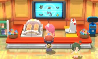
 Whether it's the meeting with Professor Sorbier, the difficult choice between Tortipouss, Chimpanzee and Piplup as the starting Pokémon, or the layout of the Sinnoh region identical to our memories, the first minutes of play confirm that we're dealing with a remake that prioritizes fidelity over novelty. You will therefore have the pleasure of finding buildings, enemies and characters placed in exactly the same places as fifteen years ago. The biggest difference comes of course from the graphics processing, which abandons the pixelated 2D of the DS versions for a simple and colorful 3D, with a cute-kawaii tendency. More precisely, the characters approach a Chibi design (or super deformed if you prefer) during the exploration phases, but are represented with a more realistic silhouette during the fights. Some players have been known to struggle with this art direction, either because they don't like the "big round head on a small body" aspect, or because the dual design seems to them to lack consistency.
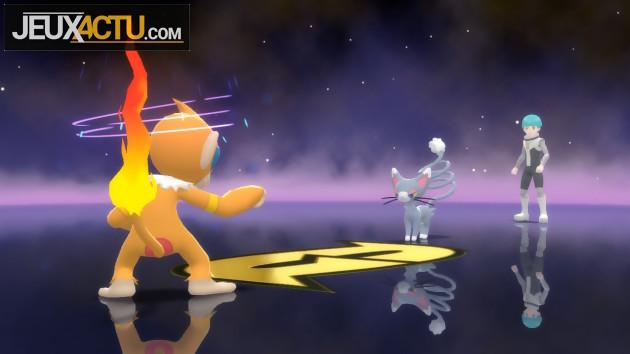
Understandable in absolute terms, these reproaches have hardly any reason to be when you think about it, since these characteristics are consistent with the graphics of 2006. The Chibi may be better in 2D than in 3D, but a radical change of style would also have created controversy. On the other hand, the developers could have refrained from zooming in on the characters so much during certain dialogue scenes. The two heads that take up half the screen are almost agonizing, and the simplicity of the textures is all the more apparent. The animations during the fights are uneven, some holding wet firecrackers and others showing themselves to be sufficiently detailed and pyrotechnic. It is in any case very pleasant to be able to observe in three dimensions Pokémon that we knew all pixelated in 2006. Similarly, the period music has been rather well reworked, while remaining recognizable.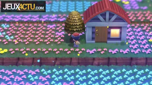
PURE DIAMOND OR JUMPY PEARL?
 Another modification compared to the original games concerns the increase in experience. From now on, your team will immediately benefit from Multi-Exp, which allows Pokémon that have not participated in a battle to still gain experience points. This option would have been extremely welcome… if it had really been an option! It is unfortunately not possible to deactivate it, which significantly upsets the general balance. Not having to farm for hours is nice, of course, but some fights that are supposed to be important lose tension and become mere formalities. One wonders why the developers did not leave the choice between a mode stamped "easy" or "modern" with the Multi-Exp activated, and a "difficult" or "classic" mode without. The overhaul of the Sinnoh Underground, on the other hand, is totally positive, since it is much larger than before and gives access to many treasures. The game also offers us some options to make our life easier, such as the possibility of running using the stick and no longer by pressing a key, adjusting the speed of text display, the possibility of skipping combat animations, and the option to skip renaming newly caught Pokémon. All this is very nice but not enough to erase the stigma of gameplay that has aged badly enough. Surprise encounters with Pokémon that do not appear in the scenery can quickly get on the nerves, while the general slowness and the display of the same texts are also likely to annoy a player looking for a modernized experience. Another stigma of the past, the Pokémontre which was once displayed on the second screen of the DS now takes up space on the single screen of the Switch. Fortunately, it is possible to deactivate its display, but its ergonomics remain dated. But ultimately, the biggest flaw of the game is to repeat the coup of the two versions not giving access to exactly the same list of Pokémon, even though Pokémon Platinum has been around for thirteen years now. Isn't a remake supposed to integrate all the content published in the past…?

